Why Do People Make 3D Charts?
18-Oct-15 Leave a comment
 The addition of the third dimension to the charts that most people make is something that has always puzzled me. It seems as if restating an essentially flat planar picture by including an added dimension adds more ‘depth’ to the message. I guess folks with a predilection to 3D think that they are adding more weight to their chart (and therefore their argument) by doing this. And also some ‘enhanced’ aesthetics.
That gets me to my main point. This is so so wrong. It is not about the chart at all. The excessive use of 3D talks a lot about the person who prepares this chart. Yes, a lot of criticism has been leveled at Microsoft Excel for continuing to offer super un-intuitive and irrelevant chart options and presets in its charting menus. Ribbons have come and gone but MS Excel continues to offer murderous weapons of data visualization. Now, if a murder is committed and a data story is brutally butchered, the culprit is not the agency that manufactured the weapon but the hands and brain that performed the mutilation.
So why do people do it? I have the following hunches:
- Because they are trying to please whoever the reviewer of the chart is. It never happens consciously but the urge to please is present nevertheless.
- It serves the chart creator’s misplaced sense of beauty and aesthetics. Isometric views are pleasing and more revealing, yes. But for complicated solid objects. Not for data that most of us play around with. It’s hard for me to relate to this but somehow the folks that render 3D charts genuinely believe that these look better. They even expect to be praised for the extra effort, if at all anyone were to focus on the presentation aesthetics.
- Value Add. Anything that happens easily or anything that is free raises suspicion. The much maligned but quite popular chart wizards of MS Excel render a chart at a click of a button. This does not satisfy the chart maker since it comes out pat. So out come the works: pschedelic colours, black backgrounds, 3D, etc. Its almost like a super avid gardener obsessively plucking out imaginary weeds from his patch to justify his extent of his passion for the gardening.
- Conformance. Everyone else is doing it or I was told to do it. I may be a newbie and may have been told to make it in 3D since “that’s the way things are done around here”.
- The Chart Lie factor. Some people do it because they want to purposely distort the message and “lie” through their charts and make it confusing for the reviewers. This percentage of such people is very very small.
My suggestion: avoid 3D unless showing spatial engineering, scientific or mathematical data. I don’t think too many readers of my website are engaged in visualization of engineering data like the locus of an electron in a cyclotron, or the spatial plot of isomorphic mathematical figures ….
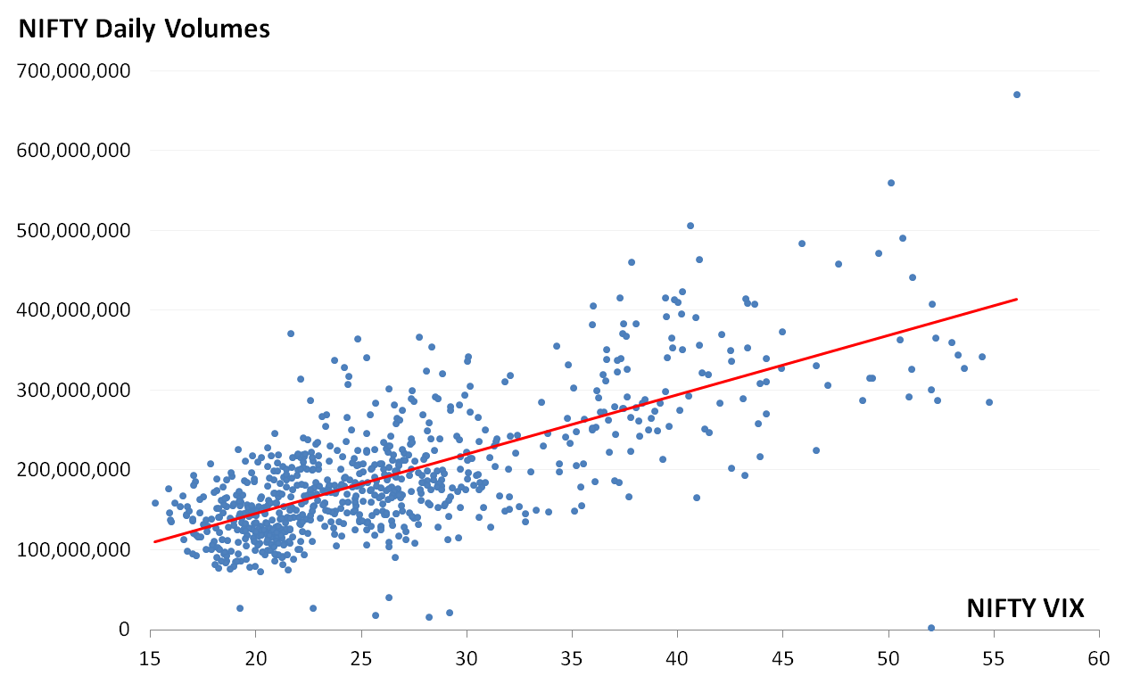
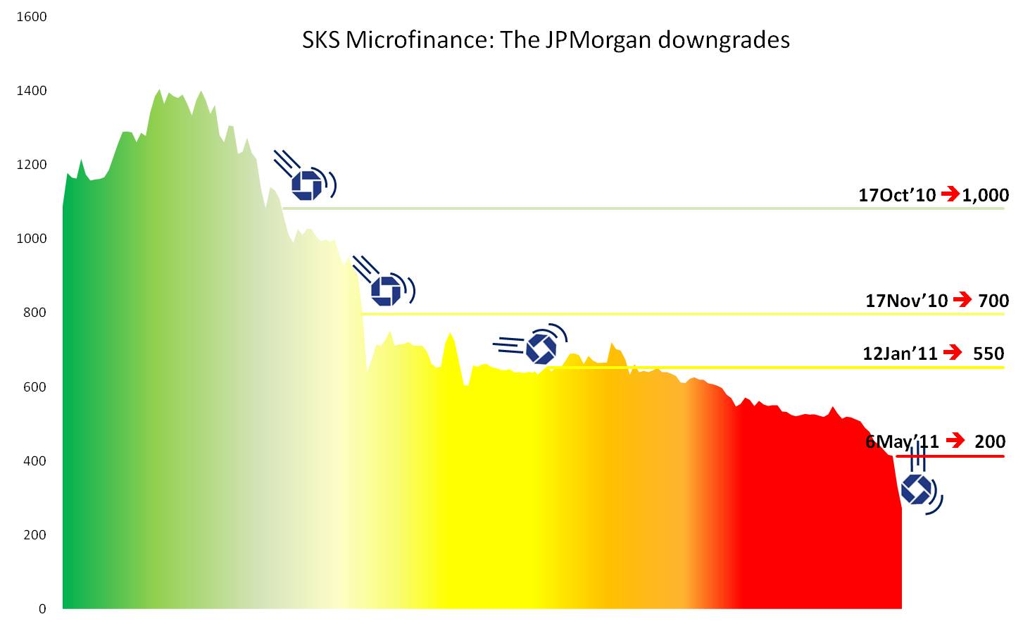
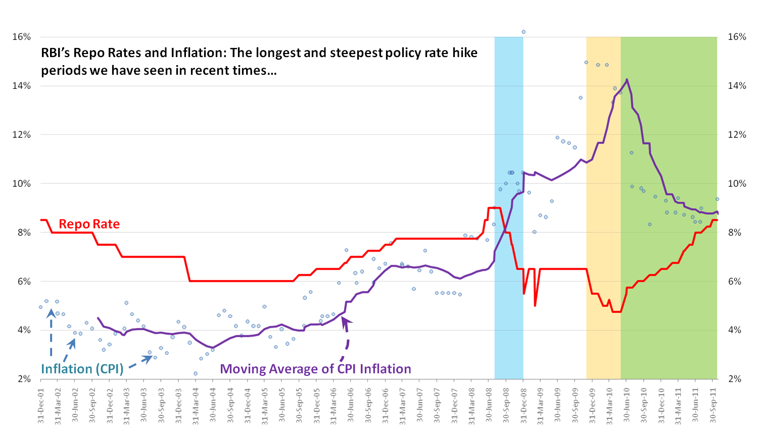
MS Excel is vilified, but it is just a tool and quite powerful at that if one handles it with patience and precision. Maybe passion as well. I have pinned below some of my favourite visualizations that I have posted on this website earlier. Each of them have been prepared by me using standard features of MS Excel and the image editing functions of MS PowerPoint. 🙂


Recent Reactions