The Rising Tide

NASDAQ Composite
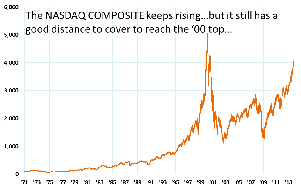
Will the US market ever pause and think? It’s been rising continuously since 2009 with maybe 4 – 5 good sized corrections thrown in for the sake of good order. I think it’s important for its own sake that the market stops and gives us a nice juicy correction. No one for sure knows when it’ll happen, but a significant correction does look probable one day or the other (as probable as the death that awaits us!). This seemingly parabolic rise (y = a * x^2) of the NASDAQ Composite since the past 4 years requires energy for sustenance – which we know has provided by the various strains of the QE program till now. The second chart here is telling – it compares the rise of the NASDAQ composite with our desi NIFTY (the latter quoted in USD) – i.e. the DEFTY vs IXIC
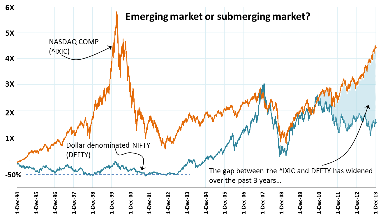
DEFTY. It’s important to compare against the DEFTY since the fx related variances are removed. Stating the NIFTY in USD is also important to see the impact that the QE has had on the emerging submerging world. The QE has effectively ‘exported’ inflation to the emerging world.

Here’s a link to an article that inter alia contains a beautiful chart on the QE program and explains how the QE now seems to be becoming quite the drag on the US GDP and long term rates than before. So is it a good idea to prepare for the inevitable and be in cash?

Barry Ritholtz discusses a perplexing slice of affluent Americans’ wealth pie that’s worrying them: cash! Are they worried because there is a raging bull market in equities next street? Or are they worried because earnings of companies are increasing? Since when did that become a cause for worry? While I am not an affluent American by any stretch of imagination, this does apply in my case as well. 🙂 I am way too much in cash these days than what the doc prescribed. Yes, I know I am losing money by the minute and I am aware of things like fixed income and its ilk (fixed maturity plans, tax free bonds, etc.) but somehow I have not been able to move myself to lighten my burden. It’s like a sack of sand with a hole at the bottom. The burden does get lighter given the hole called inflation. I have even been called by the “relationship deer headlightsmanagers” of the bank I use and have been lectured on the demerits of keeping cash in the portfolio. To my credit, I listened patiently. But haven’t acted on the tip!

Is being a deer that’s stuck in the headlights a bad thing? I guess it is. Searching for an idea that could be a good use for the cash I have. Waiting for Godot, it seems I am.

The Rupee Squeeze

What an u turn we have seen – of people of all manger of expertise who once extolled the decoupled state of Indian economy during the erstwhile “India Shining” days who are now weighing in with stories of markets being joined at the hip! Local stories do little to educate on what is happening and is going to happen (!) in our local markets. Most local commentators worth their salt correctly look to charts of the SPX, USD, credit in the US etc. as reliable portends of the shape of things to come. The de-couplers of past were certainly wrong – they ignored the big glue that sticks us (and other emerging economies) together with the rest of the birds flying at the head of our skein. That glue, is undoubtedly the currency exchange rate. Take a look at the comparison of the NIFTY vs the DEFTY chart below. I have also charted the ratio of DEFTY over NIFTY – since 1994 each unit of NIFTY is getting you progressively lesser and lesser quantities of DEFTY, indicative of a massive squeeze on the INR.

NIFTY vs DEFTY Jul13DEFTY per NIFTY unit

The human eye searches for patterns where there ought to be none! My untrained eye seems to suggest a great support at 3,000 on the DEFTY. We are ~3,350 currently, so a nice 10% correction would get us there. Possible? I don’t think any expert would be foolhardy enough to put a zero probability for that happening. So, either the INR rises in the immediate term or the market falls on disappointing results or both happen to get the DEFTY down to this level. But yes, as far as patterns and psychological levels of supports go, the 3k mark does provide a nice breather.

Corr Coefficients N day returns vs next N day returnSo if you are trading, the USD:INR is obviously a huge factor to consider. The graph on the right plots the correlations between N day returns (on a given day) and the immediately following Nth day return. The blue line is for the NIFTY N day return correlations while the red line shows this relationship for the DEFTY. For positive value of correlation coefficients, one can expect that given a positive (negative) N day return, the next N day return will also be positive (negative) – i.e. the tendency for the trend to continue. Both the NIFTY and DEFTY data suggests that this correlation peaks at N = 10, implying that given a 10 day trend, it is most likely that the following 10 day period will stay true to that trend. The point here is that from an overseas investor perspective, the relationship is more pronounced as compared to the internal view. NRIs are raking it all in!! Hopefully some of them will fill our reserves with their precious FCY and buy houses here.

Rolling 10 Day Returns NIFTYPlease note – this is median behavior, the N day returns are likely to show a normal distribution with some really fat tails (9/11, bombing of Parliament, Lehman event, etc.). the chart below shows the rolling 10 day return on the NIFTY over time and its 50 period moving average line. The outliers (i.e. the fat tails of the N = 10 day return normal distribution curve) are as high at 26.8% on the positive side and as low as 27.7% on the negative side!! Shouldn’t trading be an Olympic sport?

KSE 100 Rocking!!

It seems that Indian and global (read ‘developed’) markets have finally de-coupled – a theme that people used to talk about immediately post the financial crises. This decoupling means that the US markets are rising and the Indian indices are heading lower!! In fact it is the whole emerging markets bunch that is feeling the heat and some people feel that there is more pain to come. It was this post here that inspired this entry of mine. As you can see in the attached, the BRICS bellwether indices are languishing in the bottom quartile of all the countries tracked there. Interestingly, whenever I have seen similar country stock market return rankings, I always remember seeing Pakistan amongst the top. That piqued my interest and I did some digging around a few days back to test a hypothesis that had formed: since the Pakistani market may not be deep enough, and since it is very volatile therefore perhaps it may have dropped much more than the Indian market post the 2008 crisis. The recovery, therefore, would be higher in percentage terms as compared to India. Pakistan also has inflation. It is perceived by many to be politically more unstable than India. So what’s making FIIs pump money into Pakistan (and Phillippines, etc) on one hand and vaccuum it out of India (and other large EM markets)? What is it about Pakistan bourses that makes hot money go there ignoring the seductive siren song of rising yields in the US? Surely it cannot be asset allocation based weight correction. It doesn’t seem to be an expectation of political stability either. Perhaps it is a feeling that the market is undervalued on a relative basis. Relative to what? The emerging basket? It’s neighbours (India, China & Russia)? Or it’s past? Whatever the answer, I kept coming back to my hypothesis. So some downloads from Karachi Stock Exchange and the NSE and some number crunching/charting yielding the following perspectives:

KSE vs NIFTY historical

Parabolas are very scary. It seems as if of late the KSE 100 is rising us as if KSE 100 = A x t squared. where t = time. Now parabolas require massive amounts of energy to sustain themselves. In the context of the stock market, more money needs to be continuously pumped in for every unit of time elapsed. According to me, if the KSE 100 and it’s ilk form your scene, it’s time to short.

KSE vs NIFTY historical normalized

More Pain?

Too many people are expecting a correction in the S&P 500 these days signalling the end of a very handsome rally. The chart below (from Yahoo!Finance) compares weekly price movements of the NIFTY, the iShares MCSI Emerging Markets Index (in $s) and the S&P 500 over the past 4 years. The NIFTY and the S&P 500 have both returned around 90% over the last 4 years while the MSCI EM Index is much lower at a 64% gain. Interestingly, the NIFTY appears just slightly more volatile than the S&P 500 – visually, at least.

MCSI EM Index vs NIFTY vs SP500

Would that dunk the desi stocks? I know its too early to take a punt but I have done just that – gone long on the NIFTY ETF. I should have looked at the weekly chart too – that may have held me back perhaps. The chart below on the left shows the past 18m daily NIFTY party – support around 5600, 200 DMA, RSI almost touching 30, etc. So I bought the market. Post purchase dissonance ensued and when I looked at the weekly chart, I was like errrrr….while 5600 still looks supportive, there’s still some space between the latest weekly close and the 50 DMA and the RSI of the weekly does have room to fall further. 😦 Too many of the initiated, unsinged, un-unlucky investors ignore the advice of the weekly and the monthly charts. Will do a post one of these days digging deeper into the ‘lazy charts’ as I dub them to be.

NIFTY daily 25Mar13NIFTY weekly 25Mar13

Rolling 200 Day Returns: NIFTY

I recently constructed this chart which shows the rolling 200 (calendar) day returns if one had just passively invested in the NIFTY over the last 10 years or so. As you can see this has been one heck of a ride. The unlucky ones were those who caught the first massive correction which happened post Jul’08 – this first red trough would have applied to investments done during the Jul’07 – Jul’08 period. similarly the second red trough pertains to investments done during the Sep’10 to Jul’11 period. There is a little flutter of green appearing towards the end. Hopefully, this will cause another sustained period of green for the next 12 months or so to come. Looking at the peak 200 day returns of >90% one wonders if we will ever see such kind of exuberance ever in the near future…

NIFTY Total Return Index

Dividends now represent 27% of the total return index of the NIFTY since the start of 2000. What this means is that assumming that the changes in index constituents are pari passu, if the dividends issued by the component companies of NIFTYwere reinvested/reconsidered back into the NIFTYcalculations then the value of the index would roughly be around 6,728 (27% more than the current NIFTY value of 5295, as at 1Apr’12). The Total Return Index (TRI) tracks the capital gains of the NIFTY stocks and assumes that any cash distributions, such as dividends are reinvested back into the index. The German stock market DAX is an example of a TRI while NSE distributes historical values of its TRI here.

I downloaded NIFTY TRI and played around with the data trying to find some patterns and inferences. The first chart is a simple compare of the NIFTY TRI (dark green line) against the NIFTY (dark brown line) with the difference between them shaded in light green. The gap between the two indices is also shown in the second chart. I am unable to make any meaningful conclusion from this chart.

The third chart is interesting. This shows a comparision of the continuously trailing 1 yr returns of the NIFTY TRI compared with the trailing 1 yr returns of the NIFTY since 4Jan2001. Given that the NIFTY continuous 1 yr returns have swung widely over a +120%  to -50% range during this period, the difference between the two lines is not noticeable at all. The small footer chart shows the difference between the two series of 1 yr returns. What came out was that the trailing 1 yr returns of the NIFTY are always greater than the trailing 1 yr returns of the NIFTY TRI. Duh. This did not make any sense to me. I guess the major insight, though unrelated to the topic of the post, is the amazing wild swings in the trailing 365 day returns of the NIFTY. Can anyone spell V  O  L  A  T  I  L  I  T  Y for me? 🙂 

NIFTY Volatility Index (Part 2)

 In my previous post I had talked about the high negative correlation between the VIX and its underlying, the NIFTY. The chart on the right shows the actual movements of the NIFTY compared with the corresponding VIX moves. The period covering Mar’09 to Sep’10 marked a very rapid increase in the market (NIFTY rose from 3000 levels to 5,500). Since the VIX indicates volatility, the period at the start of this phase saw the most rapid increase in the NIFTY (in percentage terms) and that is why the VIX readings were above 40% during this time. The period from Sep’10 till date however have seen the market mostly move in a sideways direction. It started off around 5,500 in Sep’10 and is now at the 5,300 levels. Accordingly, if you look at the VIX, it has also remained mostly flat. Now, the big thought in my mind is this: we hear mostly bullish noises these days. Golden Cross; correction within an overall bullish trajectory etc. So, if the negative correlation were to hold and the NIFTY were to move up from now, it is logical to expect the fear (i.e. VIX) to come down from its current levels (~24%) t0 something like a 15% (?) or so. Since the start of this chart (chosen since that is the date range for which NSE publishes its VIX values) marked the markets coming out of a rather exceptional period in its history (global banking sector meltdown), VIX values > 40% may be really rare to come by again in the near future.  I have nevertheless plotted a dotted red line on the VIX portion of the chart which shows the median level of the VIX range. In the event that the VIX ‘reversion to the mean’ becomes a reality in the months to come then I guess we should brace ourselves for another secular fall in the NIFTY. If you take the economic events near the starting period  of this chart to be exceptional, and ignore the corresponding VIX values as outliers, then the new median will be quite close to where the VIX is today (22% – 24%) in which case there is definitely a case for it to fall down to late teens/earlier twenties. As you can guess I am rooting for a rise in the NIFTY and trying to twist my data interpretation to fit that notion!! 🙂

 The correlation factor in the above chart comes in at a high -0.83. Why such a high number? The reason could be because increased volatility (i.e. high VIX) signifies more risk. To keep their portfolios in line with their risk preferences, market participants must deleverage. Since long positions outweight short positions in the market as a whole, deleveraging entails a lot of selling and less buying (since the longs have to be shortened). The relative increase in selling causes downward pressure on stocks. The volume rise in the NIFTY puts really drives the VIX up. The NIFTY VIX is a weighted sum of puts (strikes < forward) and calls (strikes > forward) on the NIFTY. The weights are proportional to 1 / [(strike)^2]. As the NIFTY goes down, all the out of money puts become more valuable and those start having the highest weights (since the weights are the reciprocals of the strikes).

The unit of measurement of the VIX is in percentage terms. Its value essentially signifies the % expected movement of the NIFTY over the next 30 calendar days. So, for example, since the value of NIFTY VIX was 24.33% (on 29Mar’12), what the market is essentially saying is that it expects the NIFTY to move (either up or down) at a 24.33% annualized rate over the next 30 days. This implies that the market is pricing in a 24.33% /SQRT(12) = 7.02% movement at current levels over the next 30 calendar days. Which btw, is huge! In terms of confidence level, this means that the near term options on the NIFTY are being quoted with the assumption of a 68% likelihood (1 sigma) that the magnitude of NIFTY’s 30 calendar day return will be less than 7.02% (either up or down)

Taleb here points out how even seasoned market participants wrongly derive mean deviation (the 7.02% deviation as at yesterday’s close) from measures of standard deviation. My uninformed take on this is that if all are consistently making this error then that becomes the norm. Consider for instance, that a standard market data provider like Reuters or Bloomberg inadvertently distributes erroneous reference data – since both sides of the trade are using that same value, it becomes the de-facto standard and no one is out of balance.

VIX as a trading indicator: Since the VIX is a measure of dispersion and has a reversal to the mean property, all the standard technical indicators like RSI, Bollinger Bands etc can be used as identifiers for trade entry points. Since we do not have derivatives on the VIX in India yet, these technicals can give entry points into the underlying (i.e. NIFTY) by inverting the logic (buy for VIX would be a sell for NIFTY) due to the high -ive correlation between NIFTY and VIX. There have been studies which point out that the 2 period RSI on the VIX gives a very good trading signal. If the RSI (2) of the VIX >90, then buy the underlying and if RSI (2) < 30, then sell the underlying. Underlying = NIFTY in our case. I do not have any ready charting software at hand, so I will have to painstakingly generate the RSI values in a spreadsheet if I have to test and see how this really could have played out on historical data. Maybe fodder for a future post… 

NIFTY Golden Cross

Further to the last post, here’s the trailing 18m NIFTY chart which shows that new golden cross that has just happened. The question really is – how long will the 50 DMA stay above the 200 DMA line?

NIFTY’s Crossovers

A golden cross happens when a smaller daily moving average intersects and moves above a larger daily moving average, commonly the 50 DMA squigglier line cutting above the meandering 200 DMA line. They say that golden crosses mark the transition into the bull market. Well, NIFTY sure seems to be plotting and planning a golden cross and I guess the next few days will make it clear. The budget is around the corner, so it may very well be the case of Mr. Market holding its breath, crossing his fingers and hoping that nothing stupid, unexpected or untoward happens – all the populous evil having already been factored into the price. If the day passes over (RBI is widely expected to sit out of this party having done its bit in terms of the CRR cut) then its likely that the market resumes its upward journey with the 50 DMA pulling away from the crossover point.

So, I pulled up data on the NIFTY from 2000 and charted the various crossovers between the 50 DMA and the 200 DMA. The green columns indicate days where 50 DMA > 200 DMA while the red ones are for days where 200 DMA > 50 DMA. The gray mountain range is the NIFTY during this entire period (17Jan02 to date) rebased to zero at the starting date of this chart (i.e. 17Jan02). The reason the chart starts from 17Jan02 is because I have NIFTY data from start of 200 and from that date it took upto 17Jan02 for the first golden cross to appear (if the index values before 2000 are ignored). The point is that up till now the proportion of days that the 200 DMA is greater than the 50 DMA (bearish climate) has been quite low – as you can infer visually from the chart.

Confirmation Next Week?

The NIFTY chart is poised at an interesting point as at this weekend. The 50 EMA is about to deliver a right uppercut to the 200EMA…hopefully. If it does, then I guess the bull market will be really, really confirmed. Budget dithering and the slipperiness due to oil may keep the 200EMA above the 50EMA though…

Lupin’s about to break out, Gitanjali and Godrej Industries are doing awesome; so is my relatively recent pick – Jubilant Foodworks. I’m long a NIFTY ETF as well…looks like the smile may just about be coming back…fingers X’d

%d bloggers like this: