The Dashboard of Your Life

life circles RAGThe average life expectancy in India is now 67.3 years for males and 69.6 for females. Each passing decade seems to add 5 years to the average life expectancy. In a couple of decades, we could have Indians living to be three quarters of a century on an average. While it would normally mean that the working age also moves outward but that is unlikely to happen in India since there is a wave of youngsters getting introduced to the working classes each year effectively pushing out the older workers out into their retirement. The average retirement age may therefore continue to be around 58 years in India in the next 10 – 20 years to come.

So what we do we with so much time at our disposal? I am not talking about retirement and finances etc. I am talking about the discord between one view of our life where time just seems to flit by making us think that we never have time for the good stuff and the other view of life which emerges only when you step out of the day to day and look at the vaudeville of our life in total. 67.3 years is a lot of time. There’s loads and loads of time to accomplish lots and lots, provided our health remains our friend.

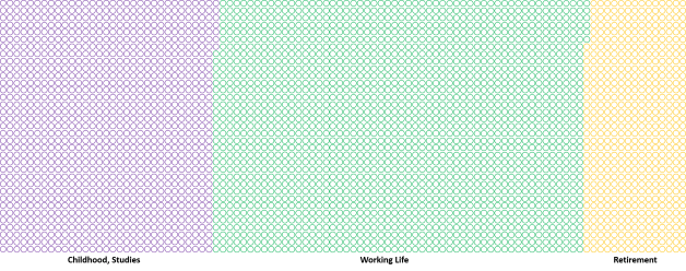
I created the picture below to depict the expanse of opportunity available with an average Indian male from a temporal perspective. Imagine each circle to be a week in a typical life where one starts earning at the age of 21 and stops doing so around the age of 58. Imagine also that you are filling up each circle with a RAG palette of colours to indicate the quality of that week. Perhaps we can also include a blue colour to depict a relaxing vacation where you don’t do much. You are the sole judge of whether a circle is to be filled in with red or green or amber. You do so on parameters of your choice, balancing your work and your life priorities. The purple bordered circles show each week of your childhood and student life,  the green ones are where the greenback flows in and golden yellow is the colour of your retired life.

For the weeks that you have lived, how does your dashboard look like as at today? Could it have been different? How would it look like at the end of your life’s book when the credits start rolling? 🙂

Life Circles v2

Sikkim

Ran off to the Himalayas for a holiday and now back after a recharge. What a beautiful place lived in by such good and simple people.

Sikkim Boy Pelling

Why Do People Make 3D Charts?

3DchartUgghhThe addition of the third dimension to the charts that most people make is something that has always puzzled me. It seems as if restating an essentially flat planar picture by including an added dimension adds more ‘depth’ to the message. I guess folks with a predilection to 3D think that they are adding more weight to their chart (and therefore their argument) by doing this. And also some ‘enhanced’ aesthetics.

That gets me to my main point. This is so so wrong. It is not about the chart at all. The excessive use of 3D talks a lot about the person who prepares this chart. Yes, a lot of criticism has been leveled at Microsoft Excel for continuing to offer super un-intuitive and irrelevant chart options and presets in its charting menus. Ribbons have come and gone but MS Excel continues to offer murderous weapons of data visualization. Now, if a murder is committed and a data story is brutally butchered, the culprit is not the agency that manufactured the weapon but the hands and brain that performed the mutilation.

So why do people do it? I have the following hunches:

  1. Because they are trying to please whoever the reviewer of the chart is. It never happens consciously but the urge to please is present nevertheless.
  2. It serves the chart creator’s misplaced sense of beauty and aesthetics. Isometric views are pleasing and more revealing, yes. But for complicated solid objects. Not for data that most of us play around with. It’s hard for me to relate to this but somehow the folks that render 3D charts genuinely believe that these look better. They even expect to be praised for the extra effort, if at all anyone were to focus on the presentation aesthetics.
  3. Value Add. Anything that happens easily or anything that is free raises suspicion. The much maligned but quite popular chart wizards of MS Excel render a chart at a click of a button. This does not satisfy the chart maker since it comes out pat. So out come the works: pschedelic colours, black backgrounds, 3D, etc. Its almost like a super avid gardener obsessively plucking out imaginary weeds from his patch to justify his extent of his passion for the gardening.
  4. Conformance. Everyone else is doing it or I was told to do it. I may be a newbie and may have been told to make it in 3D since “that’s the way things are done around here”.
  5. The Chart Lie factor. Some people do it because they want to purposely distort the message and “lie” through their charts and make it confusing for the reviewers. This percentage of such people is very very small.

My suggestion: avoid 3D unless showing spatial engineering, scientific or mathematical data. I don’t think too many readers of my website are engaged in visualization of engineering data like the locus of an electron in a cyclotron, or the spatial plot of isomorphic mathematical figures ….

MS Excel is vilified, but it is just a tool and quite powerful at that if one handles it with patience and precision. Maybe passion as well. I have pinned below some of my favourite visualizations that I have posted on this website earlier. Each of them have been prepared by me using standard features of MS Excel and the image editing functions of MS PowerPoint. 🙂bolly-tempsnakes 2KM Trades till date 06Apr12NIFTY VIX and Volumes00166_SKS The JPM Cuts00158_RIL INFY Creamy Layer00126_Returns Across Holding PeriodsInflation and RBI Repo00142_Diwali Rockets

What Unites India

What Unites India

India’s Shrinking Farmland and the Migration to Cities

Acerage TrendIndia and US trends in acreage per farm plot are opposite. Farms in the US are getting larger while those in India are shrinking. Consolidation lends to economies of scale, higher mechanization rates and therefore greater productivity and profits per acre. Farmers in the US are experimenting with big data, information analytics with farmers showing as much interest in selling the data from their farms as much as their crops. Farmers in India, on the other hand, are contemplating ending their lives adding to the big bigger data points on farmer suicide statistics – at least some of them kill themselves each year. The rate however is not as alarming as it is made out to be. More people die of suicides outside of the farms. I am sure depression kills more in our cities but farmers attract attention.

India Farm Size ShrinkageThe chart above shows the general shrinkage of farm sizes across the India. The average size of farmland in India has fallen from 2.28 hectares in 1970-’71 to 1.16 hectares in 2010-’11. Punjab is an exception. If you want to sell tractors and motor pumps and pvc pipes, this is the place to hang your shingle. Increased mechanization and dwindling farm incomes forced many small farmers to quit farming, migrate to Kanaada leading to a consolidation of farmlands. In almost every other state, there is a shrinkage. It is no doubt a consequence of
increasing pressure on the land due to an ever expanding population. With lower farm plots (i.e. capital) and the low productivity rates, it is impossible for the farm incomes (return on capital) to be enough to feed the stomachs aspirations of all the strapping young village gabrus hanging around in the hinterland. Kerala and Bihar are the two states with the lowest average acreage per chhath_train_71113 [httppost.jagran.com]farm plot. It is not surprising that the villagers from these states are most likely to be found migrating to other parts of the country in search of work. Trains are best avoided during annual jaunts like the Chhath Puja when all the itinerant workers head back to their native places to take the traditional early morning dip in obeisance to the sun who no longer shines on their farms as it once used to.

Rain Rain (Please Don’t) Go Away

dailyYesterday was unusually different. We have all lived through hotter days but the combination of dryness, heat and disappointment was unique given it is just the start of September. The weathermen and all related folks consider the rainfall received in the four month period from June to September as representing the rainfall for a particular year’s S.W. Monsoon quota. Using data from the
India Meteorological Department (IMD) website, here is the story in pictures.

2015 monsoon till date has been grossly insufficient and with just Sep 2015’s data to be made available, things don’t seem to be looking too bright. With days like yesterday, I am not sure if the rest of the days left in this month will make good the gap. So, in addition to the external stories weighing down on the stock market, this internal will, no doubt, add impetus to the decline. Maybe the efficient markets have factored this in, maybe not. The Indian economy may be resilient to droughts but it is certainly not drought proof.

If you look at the charts below, the heavens have not been too kind over the last 15 years. Looks quite similar to the decade at the start of the 20th century.

SWMonsoon Variation

I think we will end the 2015 Monsoon season at the 750 – 775 mm of rainfall band.SWMonsoon Histogram


Accuracy and Precision

Are accuracy and precision the same thing? They are certainly used interchangeably. Accuracy is telling the truth while precision is telling the same thing again and again.

Here’s something I created based on what I have been reading lately. If you are in the bottom left quadrant, you are inaccurate and imprecise in your work, your investments or in your life, you are basically wasting your time and resources. If you focus on one area or strength or specialization and shut everything else, you may move along arrow #1. This is a path of standardization of processes, doing one thing and doing it repeatedly. You’ll be quite predictable but if your area of specialization is not well chosen, you’ll be far away from winning big. Then a focus on the problem statements you’re trying to solve or the way you spend your time may lead you on path #3 and take you extremely close to the truth and quite predictably too. You get into the habit of winning and you win repeatedly.

On the other hand, if you want to escape wasteland by taking path #2, you would essentially continue to multitask and continue to be curious and exploring but with better tools, techniques and processes. Paths #2 and #3 are the avenues for invention and process improvements, of changing the game. paths #1 and #4 are about repeatability and efficiency.

If this is worth your time, do examine a topical issue that you may be mulling over using this lens – maybe it will be worth your time after all!

accurate precise

Your Paths to Success in your Career

This is how some people plan their careers:

snakes1

This is what actually happens:

snakes 2

snakes 3

Humility and Arrogance

A Venn to ponder on. What do you think? This just came to my mind when I was preparing for a meeting today:

Humility and Arrogance

University’s Gender Commotion

199University Grants Commission’s National Eligibility Test is one entrace exam that I would never be able to crack however hard I tried. This exam is taken by candidates who are keen to land university level teaching jobs or secure junior research fellowships in universities. Inter alia, the most recent iteration of the exam that was conducted last weekend contained questions like:

At primary school stage, most teachers should be women because:

a) can teach children better than men

b) know basic content better than men

c) are available on lower salaries

d) can deal with children with love and affection

🙂

The exam (for university teaching posts) was first rolled out in 1989 after considerable delibration on the poor quality of individuals being selected in the teaching profession. If the above is the standard of the questions being asked, I wonder how is the exam living up to it’s billing. Given that 13,000 candidates took the test last weekend, would such questions differentiate talent? Presence of such absurd and silly questions seems to be one of the reasons why the cut-off marks is in the range of 55% – 65% (depending on your ‘category’). On top of that there is an awesome amount of mismanagement of results and the examination has seen it’s share of controversies and dharnas and protests. There have been candidates who have scored lesser than the stated cut-off threshold yet have been selected!! Aren’t we cool?

%d bloggers like this: