Economic medicine that was previously meted out by the cupful has recently been dispensed by the barrel. These once unthinkable dosages will almost certainly bring on unwelcome after-effects. Their precise nature is anyone’s guess, though one likely consequence is an onslaught of inflation.
Warren Buffet
I did some number crunching and came up with the chart on the right. It shows the movement of the price of a liter of petrol in INR (stepped blue line) vs. it’s price in equivalent dollar terms (red line) over the past 10 years. The price of  petrol in equivalent USD terms has always been higher than the local retail price except during Jan – Feb ’09. Petrol pricing strategy seems to rely on ‘fixing’ the retail price of the fuel so as to minimise the tracking error against the red line. I constructed this chart to test this exact same hypothesis – point being that the red line is indicative of what the Indian refiners have to pay, in USD, for buying crude oil from the international markets. The blue line is obviously indicative of the revenue they get when they sell it to Amar, Akbar and Anthony. So the gap between the red line and blue line essentially indicates the subsidy burden that the Indian economy and therefore what AAA (the three gentlemen above) have to bear via taxes.
 Also, between the INR:USD exchange rate and the petrol price, the latter is the dependent variable, i.e. exchange rate causes petrol price policy. This also comes out through the tracking movement of the blue line vis-a-vis the red line in the chart above. I doubt if all get this – many think that recent petrol price hike will help arrest the recent fall of the INR. Well, nothing like that happened today. Most people also think that the RBI can intervene to control the INR. The fact is that the INR fx market is too large for the RBI to control anymore. We are living in very different times from 10 years ago [ref: these excellent articles by Ajay Shah. click here and here].
Now, what’s interesting with this recent hike is that it has happened at a time when the global price of Brent crude has been in a continuous fall since April this year! So India has increased its retail petrol prices despite a near 20% drop in the global price of oil! Reason being that while global crude oil prices fell by 20%, the INR dropped a similar amount in the same time thereby negating any benefits that could have accrued due to a lower oil import bill.
Also wanted to jot down the observation that the quantum of the recent blue line spike (i.e. price hike) is very high indeed. Maybe the Government had anticipated massive opposition to the move and hiked a lot so that they can roll back a partial amount to appease the insulted. Or it could be that Finance Ministry is seeing the INR go down to 60 soon and therefore have announced a one time whopper of an increase. I do not know what’s behind me but my chart certainly points to an anomaly – i.e. the blue line troucing the blue line by such a wide margin – perhaps for the first time in the past 10 years. Whatever be the explanation, the chart makes it quite clear that we live in exceptional times today and that all manner of caution and discretion is advised especially when allocation your capital to your ideas.
Incidentally, I am wondering if I should increase my ‘work from home’ days given that the price of petrol in Hyderabad has risen from 65.15 (16Jan’11) to 80.58 (24May’12) representing a 17% annualized increase. The only two major cities where petrol is more expensive than Hyderabad are Jallandhar (80.68) and Bangalore (81.01). Petrol remains lowest in Goa at 68.51, but even there, as in all Indian cities, beer is cheaper than petrol!! Cheers.
Please scatter it around:
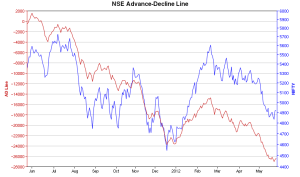
 Here are two plots – the first is the daily breadth of the NSE listed stocks (the A/D ratio). The A/D line is at it near lowest since the past 12 months with the benchmark index also moving in the same lock and step with the A/D line. This chart is from http://icharts.in and I was too lazy to plot the broader market indices (other than NIFTY) but even then the NIFTY superimposition on the NSE A/D line does seem to point to some trend reversal in the days to come.
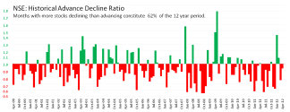
 The second chart shows the monthly A/D ratio for all NSE stocks. The months which had more stocks falling are shown as red negative columns. The chart is more red than green despite the NIFTY having returned 236% during the same period which represents a gain of 10.9% compounded per annum. I guess this hints at the quality of listings on the NSE. The action is always in the frontline stocks – not that you needed a chart to reveal that! But maybe the visual might serve its purpose if it makes you pause and rethink any decision of yours that may be asking you to throw money on small, unloved, thinly traded and operator driven stocks.


Recent Reactions