NSE Advances vs Declines
26-May-12 Leave a comment
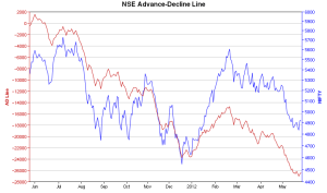
 Here are two plots – the first is the daily breadth of the NSE listed stocks (the A/D ratio). The A/D line is at it near lowest since the past 12 months with the benchmark index also moving in the same lock and step with the A/D line. This chart is from http://icharts.in and I was too lazy to plot the broader market indices (other than NIFTY) but even then the NIFTY superimposition on the NSE A/D line does seem to point to some trend reversal in the days to come.
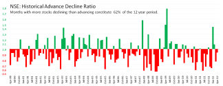
 The second chart shows the monthly A/D ratio for all NSE stocks. The months which had more stocks falling are shown as red negative columns. The chart is more red than green despite the NIFTY having returned 236% during the same period which represents a gain of 10.9% compounded per annum. I guess this hints at the quality of listings on the NSE. The action is always in the frontline stocks – not that you needed a chart to reveal that! But maybe the visual might serve its purpose if it makes you pause and rethink any decision of yours that may be asking you to throw money on small, unloved, thinly traded and operator driven stocks.
Recent Reactions