The Long “Weight” for Corrections

Or, insulin vs. investing.

Gaining weight is like a stock market correction. Happens so swiftly that even before you know it your center of gravity and your wealth would have shifted down. On the other hand, losing weight and the climb of prices is a gradual process. I don’t know about the markets but i wish dropping weights would be as simple as lifting them.

Golden Ratios

China, it seems, wants to load up on gold. There is an aggressive retail push going on in China towards precious metals. In India, on the other hand, there have been appeals to buy less gold, use our forex for better things, turn out our gold hidden in bank lockers etc. As if we Indians will ever listen to that! The buying continues unabated. This is also in keeping with popular perception that Indians (and increasingly, the Chinese now) have a voracious appetite for gold. Pivoted around this idea, I ran some numbers to figure out gold reserves for the top countries, the amount of gold reserve coverage given the GDP size of each country and finally how much gold reserves exist in a country per person of its population. The latter is an interesting metric – it says that if all the citizens of a country were to line up in front of their central bank’s vault to receive equal amounts of gold, how many grams or kilograms would they get. The results for 41 top countries (by gold reserve holding) is shown in the chart below:

  • USA, with the world’s largest gold reserves drops down to 23rd place when compared to countries on gold per Bn USD of GDP
  • India and China, at 10th and 5th places drop down to 37th and 35th places when it comes to the weight of gold per capita! Clearly, we should buy more!!
  • Lebanon and Libya are pricing in their geopolitical risk by paying rent and holding charges for all the massive horde of gold that they have given the size of their economy.
  • Germany, France and Italy are very well placed. From where did they get all their gold, I wonder.
  • Canada’s position surprised me.

Golden Countries

So is there a trading play in Indian gold? I am not a goldbug enough to know. Goldbugs don’t know anyways. Maybe there is a 5% – 10% scope in gold in rupee terms that is possible now. Constant pressure on the rupee has kept the INR gold chart very subdued as compared to the USD price of gold.

The first chart below shows the daily price chart of a local Indian gold ETF over the last 18 months – on the charts, it does not show a set-up which gets me excited. On the longer 3 year chart with weekly prices, there certainly seems room but again, the present price does not scream a buy (to me).

Gold 3Feb16 18mo DailyGold since 2008 weekly

All Fall Down

Back after a gap of more than a year. A lot happened in the interim. Completed my 40th turn around the sun, have been reading a lot (all non-fiction) and struggling to overcome my writer’s block. I guess a few of you literally kicked me out of my slumber to start writing again. Another motivator to post is what I have been reading lately:

That the markets may be getting ready to fall big this fall. All over the world stock markets are crashing. Even The Telegraph has started talking about doomsday and other apocalyptic messages. Do read the link if possible – has a lot of charts and explanations in a (hopefully) simple to understand manner. The Chinese devaluation of their currency was a shocker (in more ways than one). Not that I was long on the Remnimbi Yuan but some things happened. I had to down myself a couple of pegs even as our neighbours downed their currency a peg or two down. So I looked up the performance of some world equity indices and their corresponding currencies during the trailing twelve months to develop a personal view on what’s happening.

The chart below shows a scatter of the % change of a country’s representative stock index plotted against the corresponding % change in its national currency vs. the USD. A few outliers like Venezuela (stock market up 500%?) and Ukraine (equity down 27% and currency down 60%) were left out to bring the other data points into comparative focus. The worrisome point is that while we may not think much about a Ukraine being an outlier (due to relatively lower market cap) but then what would you say to a Russia with a currency devaluation of 77%? The other thing of note in the chart below is the bunching up of the green dots. They represent the various Eurozone countries, most of them falling in a common “y-band” due to the pegs that they have on the Euro. The question of entropy and equilibrium that I am asking is: How can a -40% to +40% range in equity returns sustain itself on a foundation of such a narrow difference between the movements of their respective national currencies. Doesn’t this portend to the Euro equilibrium going out of balance?

All Countries Stock Index vs CCY correl

While the above chart has data corresponding to 85 countries, the chart below shows the top 20 countries. Look at the golden quadrilateral formed by the points represented by the BRICS. Clearly each of the BRICs have followed unique paths to get where they are on this chart. Already fewer than 20% of Emerging Markets are trading above their 200 DMA levels (link, link). My hunch is that China will quickly begin moving towards the left on this chart. Smart Chinese money has already moved out of equity (link). My hunch is that China and Russia will move left the most. India will certainly move left but perhaps not to the extent that China will fall. That’s my hunch. I may be wrong, but I think soon enough a time will come when it will pay to be ready with your shopping bag. Hopefully the stock market will go ON SALE!!!

Major Countries Stock Index vs CCY correl


The Rising Tide

NASDAQ CompositeWill the US market ever pause and think? It’s been rising continuously since 2009 with maybe 4 – 5 good sized corrections thrown in for the sake of good order. I think it’s important for its own sake that the market stops and gives us a nice juicy correction. No one for sure knows when it’ll happen, but a significant correction does look probable one day or the other (as probable as the death that awaits us!). This seemingly parabolic rise (y = a * x^2) of the NASDAQ Composite since the past 4 years requires energy for sustenance – which we know has provided by the various strains of the QE program till now. The second chart here is telling – it compares the rise of the NASDAQ composite with our desi NIFTY (the latter quoted in USD) – i.e. the DEFTY vs IXICDEFTY. It’s important to compare against the DEFTY since the fx related variances are removed. Stating the NIFTY in USD is also important to see the impact that the QE has had on the emerging submerging world. The QE has effectively ‘exported’ inflation to the emerging world.

Here’s a link to an article that inter alia contains a beautiful chart on the QE program and explains how the QE now seems to be becoming quite the drag on the US GDP and long term rates than before. So is it a good idea to prepare for the inevitable and be in cash?

Barry Ritholtz discusses a perplexing slice of affluent Americans’ wealth pie that’s worrying them: cash! Are they worried because there is a raging bull market in equities next street? Or are they worried because earnings of companies are increasing? Since when did that become a cause for worry? While I am not an affluent American by any stretch of imagination, this does apply in my case as well. 🙂 I am way too much in cash these days than what the doc prescribed. Yes, I know I am losing money by the minute and I am aware of things like fixed income and its ilk (fixed maturity plans, tax free bonds, etc.) but somehow I have not been able to move myself to lighten my burden. It’s like a sack of sand with a hole at the bottom. The burden does get lighter given the hole called inflation. I have even been called by the “relationship deer headlightsmanagers” of the bank I use and have been lectured on the demerits of keeping cash in the portfolio. To my credit, I listened patiently. But haven’t acted on the tip!

Is being a deer that’s stuck in the headlights a bad thing? I guess it is. Searching for an idea that could be a good use for the cash I have. Waiting for Godot, it seems I am.

Desperate Measures to Arrest the Rupee’s Slide

I read an article in The Financial Express of yesterday about the measues taken by the RBI and a couple of other agencies to halt the rupee’s decent and constructed the following infographic.

India Controls to Stem Rupee's Slide

The Rupee Squeeze

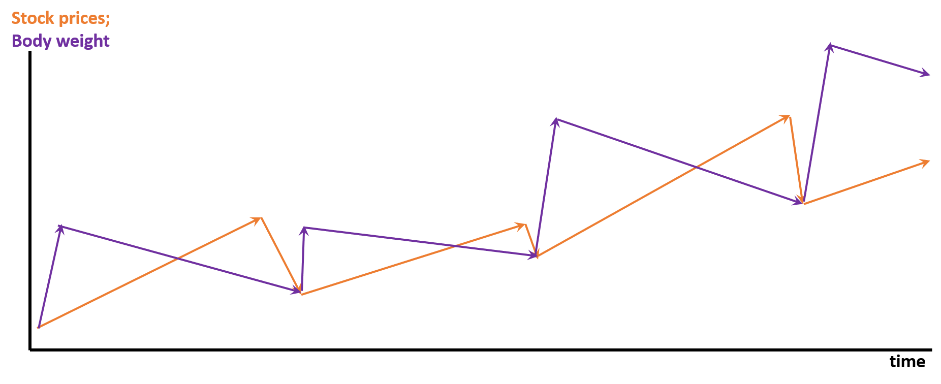
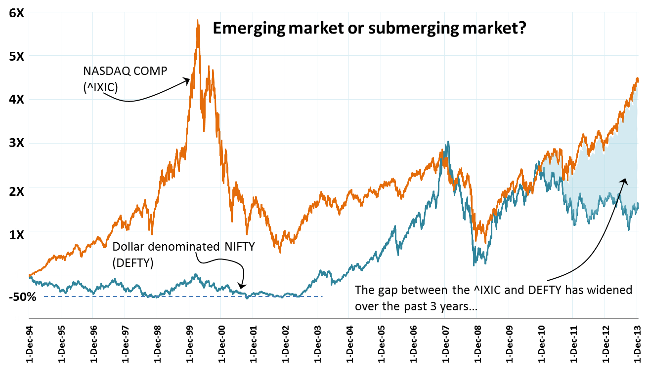
What an u turn we have seen – of people of all manger of expertise who once extolled the decoupled state of Indian economy during the erstwhile “India Shining” days who are now weighing in with stories of markets being joined at the hip! Local stories do little to educate on what is happening and is going to happen (!) in our local markets. Most local commentators worth their salt correctly look to charts of the SPX, USD, credit in the US etc. as reliable portends of the shape of things to come. The de-couplers of past were certainly wrong – they ignored the big glue that sticks us (and other emerging economies) together with the rest of the birds flying at the head of our skein. That glue, is undoubtedly the currency exchange rate. Take a look at the comparison of the NIFTY vs the DEFTY chart below. I have also charted the ratio of DEFTY over NIFTY – since 1994 each unit of NIFTY is getting you progressively lesser and lesser quantities of DEFTY, indicative of a massive squeeze on the INR.

NIFTY vs DEFTY Jul13DEFTY per NIFTY unit

The human eye searches for patterns where there ought to be none! My untrained eye seems to suggest a great support at 3,000 on the DEFTY. We are ~3,350 currently, so a nice 10% correction would get us there. Possible? I don’t think any expert would be foolhardy enough to put a zero probability for that happening. So, either the INR rises in the immediate term or the market falls on disappointing results or both happen to get the DEFTY down to this level. But yes, as far as patterns and psychological levels of supports go, the 3k mark does provide a nice breather.

Corr Coefficients N day returns vs next N day returnSo if you are trading, the USD:INR is obviously a huge factor to consider. The graph on the right plots the correlations between N day returns (on a given day) and the immediately following Nth day return. The blue line is for the NIFTY N day return correlations while the red line shows this relationship for the DEFTY. For positive value of correlation coefficients, one can expect that given a positive (negative) N day return, the next N day return will also be positive (negative) – i.e. the tendency for the trend to continue. Both the NIFTY and DEFTY data suggests that this correlation peaks at N = 10, implying that given a 10 day trend, it is most likely that the following 10 day period will stay true to that trend. The point here is that from an overseas investor perspective, the relationship is more pronounced as compared to the internal view. NRIs are raking it all in!! Hopefully some of them will fill our reserves with their precious FCY and buy houses here.

Rolling 10 Day Returns NIFTY
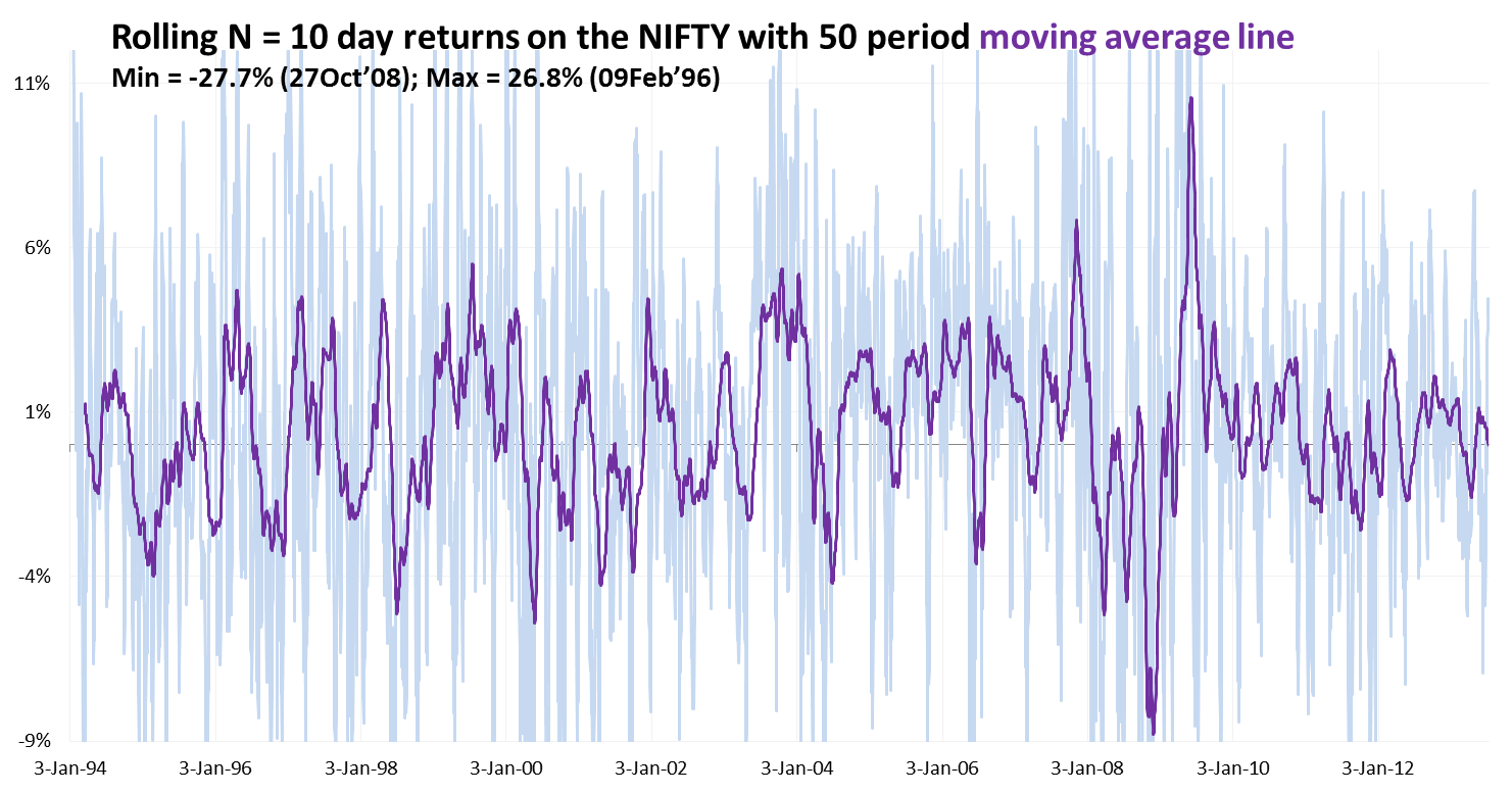
Please note – this is median behavior, the N day returns are likely to show a normal distribution with some really fat tails (9/11, bombing of Parliament, Lehman event, etc.). the chart below shows the rolling 10 day return on the NIFTY over time and its 50 period moving average line. The outliers (i.e. the fat tails of the N = 10 day return normal distribution curve) are as high at 26.8% on the positive side and as low as 27.7% on the negative side!! Shouldn’t trading be an Olympic sport?

What the Hell is Happening?

Gitanjali 30Jun13I’ve written about my position in Gitanjali Gems earlier (here, here and here). If you go back to those posts, you’d see how I’d likened that stock’s ascent to a Diwali rocket. I guess the sad truth is that now the rocket having spent it’s glory in a sparkling display of fireworks is now descending to terra firma in tattered parts. Bearish international reports on gold must have induced some FIIs to sell off tipping the cart. Given that the June expiry was neigh, brokers seem to have stumbled triggering margin calls to fund leveraged positions that were rapidly turning out of money. Poor people like me can only pontificate and sagely philosophize that apart of 1/3rd of their sales coming from low margin gold sales, nothing much is wrong with the business model of the company. Once the churn is over, the stock will resume it’s upward climb. My position is still in the money since I was sitting on an almost five bagger on this one. I feel like a complete ass however – there was a good deal of time to act between the finmin’s announcement to increase import duties on gold and the stock tanking. If I really am a long believer in the scalability of the retail and Bollywood advertising (therefore costly!) driven sales model of Gitanjali, could I not have sold at around the top (not as a deja vu moment, but as a result of a logical reaction to finmin’s tightening of the Indian gold scene)??? Things are always easier said when in hindsight, but this one I genuinely regret. I do remember thinking about this a couple of times and dismissing the thought telling myself that they mostly sell jewellery and not gold, so shouldn’t be a problem. I hadn’t bothered to check inventory unfortunately. And therein lies the rub. 😦

Tata Coffee_30Jun13The other stock that I have been staring at for quite some time this weekend is that of Tata Coffee. I mean since when have better known counters started dislaying a pattern that looks like a square wave? remember all those electronic waveforms – saw tooth (quite common in Indian markets), sine wave (maybe long term commodity plays show this – haven’t checked) and now this square wave, like the 555 timer output waveform!! This Grand Canyonish stock chart also seems to suggest of brokerage firms triggering massive scale sell offs due to margin pressure on their client positions. It may not be related with the global price of coffee at all. Thinking if this is a cup to sip at all – not personally in the mood to do any research about the stock.

Followup post on Tata Coffee: 

– you may be aware of this, but I wasn’t. Kotak Mahindra Prime, one of the largest institutional investors into Tata Coffee sold a big deal as did one individual investor.

– this again triggered some margin calls and ergo the price is now really lying low. 

– if it falls a little bit more – say 935 – 950, it might be a good position to take.

Infosys Pay Hikes

With most Indian IT companies announcing wage hikes, it seems quite clear that the moribund economy has impacted pay hikes at most companies. It turns out that the various HR consultancies were off target by around 2% in their general predictions. Infosys has announced a 8% avergage hike this year coming on the back of a 6% – 8% hike in Oct’12. Wipro has said it’s paying up it’s employees by 6% – 8% this year; reports about TCS put it’s hike in the wide 5% – 10% band. Mid tier Mindtree may come in at 6% (same as last year?). Cognizant seems to have deffered hikes to July so that all employees across rank and file get wage hikes at the same time. I also read somewhere that IBM is not doling out any hikes this year! So the scenario is quite bleak and suddenly IT does not seem to be the hot sector that it was made out to be. Unless of course if you happen to be an IT worker seconded overseas. The recent weakness of the INR has effectively increased the value of such folks’ USD holdings by approximately a tenth!

Given this theme, a good part of my last weekend was spent in reading up assorted news stories about wage hikes reported in Indian media. On a lark, I also tried to collect historical mentions of wage hikes at Infosys (long considered by many to be the darling of the Indian IT scene) and since I try to correlate anything with everything, I tried to see how the decisions by the top brass at Infosys regarding this extermely crucial element of their cost have stacked up against their company’s share price over the past few years. As mentioned earlier, the data for the chart below has been collected from old media reports (all of them online) and as hard as I tried, I could not get the average hikes at Infosys for FY’04 and FY’05. If you know, please let me know. So, with wage hike data from FY’06 onwards, the chart below superimposes the salary hikes at Infosys over it’s share price. The share price has obviously been adjusted for the two very generous bonus issues on the stock, but it has not been adjusted for the various dividend payouts on the stock. I don’t know if you can see it, but to my “force fit a pattern where none exists” eye, I can discern a weak correlation between average hikes and the share price! And I can also see a distict lag effect between the time when the insiders (i.e. employees) feel the pinch vs. when the market drops the price!

Infy salaries trend

KSE 100 Rocking!!

It seems that Indian and global (read ‘developed’) markets have finally de-coupled – a theme that people used to talk about immediately post the financial crises. This decoupling means that the US markets are rising and the Indian indices are heading lower!! In fact it is the whole emerging markets bunch that is feeling the heat and some people feel that there is more pain to come. It was this post here that inspired this entry of mine. As you can see in the attached, the BRICS bellwether indices are languishing in the bottom quartile of all the countries tracked there. Interestingly, whenever I have seen similar country stock market return rankings, I always remember seeing Pakistan amongst the top. That piqued my interest and I did some digging around a few days back to test a hypothesis that had formed: since the Pakistani market may not be deep enough, and since it is very volatile therefore perhaps it may have dropped much more than the Indian market post the 2008 crisis. The recovery, therefore, would be higher in percentage terms as compared to India. Pakistan also has inflation. It is perceived by many to be politically more unstable than India. So what’s making FIIs pump money into Pakistan (and Phillippines, etc) on one hand and vaccuum it out of India (and other large EM markets)? What is it about Pakistan bourses that makes hot money go there ignoring the seductive siren song of rising yields in the US? Surely it cannot be asset allocation based weight correction. It doesn’t seem to be an expectation of political stability either. Perhaps it is a feeling that the market is undervalued on a relative basis. Relative to what? The emerging basket? It’s neighbours (India, China & Russia)? Or it’s past? Whatever the answer, I kept coming back to my hypothesis. So some downloads from Karachi Stock Exchange and the NSE and some number crunching/charting yielding the following perspectives:

KSE vs NIFTY historical

Parabolas are very scary. It seems as if of late the KSE 100 is rising us as if KSE 100 = A x t squared. where t = time. Now parabolas require massive amounts of energy to sustain themselves. In the context of the stock market, more money needs to be continuously pumped in for every unit of time elapsed. According to me, if the KSE 100 and it’s ilk form your scene, it’s time to short.

KSE vs NIFTY historical normalized

More Pain?

Too many people are expecting a correction in the S&P 500 these days signalling the end of a very handsome rally. The chart below (from Yahoo!Finance) compares weekly price movements of the NIFTY, the iShares MCSI Emerging Markets Index (in $s) and the S&P 500 over the past 4 years. The NIFTY and the S&P 500 have both returned around 90% over the last 4 years while the MSCI EM Index is much lower at a 64% gain. Interestingly, the NIFTY appears just slightly more volatile than the S&P 500 – visually, at least.

MCSI EM Index vs NIFTY vs SP500

Would that dunk the desi stocks? I know its too early to take a punt but I have done just that – gone long on the NIFTY ETF. I should have looked at the weekly chart too – that may have held me back perhaps. The chart below on the left shows the past 18m daily NIFTY party – support around 5600, 200 DMA, RSI almost touching 30, etc. So I bought the market. Post purchase dissonance ensued and when I looked at the weekly chart, I was like errrrr….while 5600 still looks supportive, there’s still some space between the latest weekly close and the 50 DMA and the RSI of the weekly does have room to fall further. 😦 Too many of the initiated, unsinged, un-unlucky investors ignore the advice of the weekly and the monthly charts. Will do a post one of these days digging deeper into the ‘lazy charts’ as I dub them to be.

NIFTY daily 25Mar13NIFTY weekly 25Mar13

%d bloggers like this: