More Pain?
25-Mar-13 Leave a comment
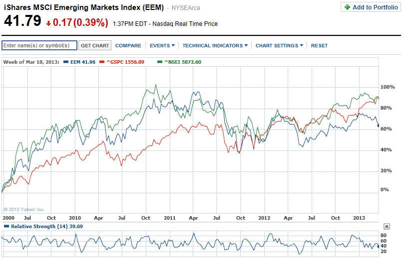
Too many people are expecting a correction in the S&P 500 these days signalling the end of a very handsome rally. The chart below (from Yahoo!Finance) compares weekly price movements of the NIFTY, the iShares MCSI Emerging Markets Index (in $s) and the S&P 500 over the past 4 years. The NIFTY and the S&P 500 have both returned around 90% over the last 4 years while the MSCI EM Index is much lower at a 64% gain. Interestingly, the NIFTY appears just slightly more volatile than the S&P 500 – visually, at least.
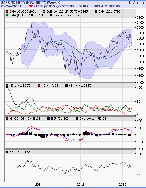
Would that dunk the desi stocks? I know its too early to take a punt but I have done just that – gone long on the NIFTY ETF. I should have looked at the weekly chart too – that may have held me back perhaps. The chart below on the left shows the past 18m daily NIFTY party – support around 5600, 200 DMA, RSI almost touching 30, etc. So I bought the market. Post purchase dissonance ensued and when I looked at the weekly chart, I was like errrrr….while 5600 still looks supportive, there’s still some space between the latest weekly close and the 50 DMA and the RSI of the weekly does have room to fall further. 😦 Too many of the initiated, unsinged, un-unlucky investors ignore the advice of the weekly and the monthly charts. Will do a post one of these days digging deeper into the ‘lazy charts’ as I dub them to be.


Recent Reactions