Risk Management and Inter Bank Dealings

This will be big news in today’s papers (posting around midnight AM) – RBI’s promulgation of capital controls to reign in the currency movement. There is a meeeting there in the RBI today for a review of its monetary, so some more interesting sound bytes should come out. What if they cut the CRR?

And Ajay Shah provides a contra view to RBI’s action. Boy! If I have to pick between the short term bounce up generated by a possible CRR cut and the medium term lower levels of NIFTY as mentioned in Ajay Shah’s post, I’d pick the latter.

BTW, at one point in time yesterday RBI’s legal tender was quoting at 54.29 times a USD! Can’t believe it. Sort term relief for exporters? Only if they prevent losing their margins to local inflation.

Emerging Markets Myths

Chart from The Wall Street Journal. The parent article talks about some reality checks regarding investing in emerging markets. And why the developing nations road to stock market earned wealth will be bumpy.

Repo Rate and Inflation

The Reserve Bank of India (RBI) has designated the weighted average overnight call money rate as the operating target of its monetary policy and the repo rate as the only independently varying policy rate in order to more accurately signal the monetary policy stance. So while cash reserve ratio (CRR), statutory liquidity ratio (SLR), market stabilization scheme (MSS) etc. are all important tools, the policy lever of RBI that is always in the spotlight is the repo rate. This is the rate at which banks borrow from the central bank blah blah…

A lot has been said about RBI’s role and its effectiveness in fighting inflation. Rate hikes are common knowledge to all in the country by now concerning that they affect people with loans in their lives. Interest rates have been rising in India (and all the emerging economies) and I had an investment thesis of catching banking stocks when the interest rate cycle turned. Interest rate senstive sectors like automobiles, real estate, banking etc. will get a breather if the rates turn. The sovereign debt crisis in Europe has however ensured that the hawks continue to circle above the Indian economic landscape. Fat chance that we may see a rate reversal. Indeed, the banking sector is badly mauled and it certainly does not look to be in a hurry to recover. I need to figure out what to do with my investment positions in Axis Bank and HDFC Bank – and towards that end I tried to read up and form an opinion on inflation, rates and their cycles. The below chart came out.

If you look at the period after mid-2008, there is a very perceptible negative correlation betweeen inflation measures and the repo rates set by RBI. I am saying correlation here. As you know, correlation does not automatically imply causality. I have shaded the three time periods of recent times where we can discern some sort of a clear monetary stand taken by the RBI. The light blue band is a period of declining repo rates. I have added a 12 period moving average of the monthly inflation rates (taken from ycharts) to show trending inflation information. As you can see, during this period, the inflation rate increased as the rate fell. Then the light yellow period (Nov’09 – May’10) shows the continuation of the trend started in the previous phase. The RBI further reduced the repo rate down to 4.75% towards the end of this phase – with inflation continuously rising while all this was taking place. Then finally, the green band, which we seem to be in today as well. Here, we all know the sequential repo rate increases affected by the RBI. The inflation rate did appear to have fallen from a high of 14%. But it is still high at 9.5% – 10.0%. So many experts (and some vested interests) have argued that the RBI should stop fiddling with the policy rates since these measures have not been successful in taming the beast. My point here is that inflation is whatever it is, but can you confidently say that the situation could not have been any worse than what it is today?

I guess, my view is that till this point successive repo rate increases have helped in “controlling” inflation. They may not have brought inflation back to the comfort zone of 5% – 6%, but they have definitely put some brakes on the juggernaut. Beyond this point, any further increases in the policy rates may actually be detrimental to the economy (from the inflation point of view)! Beyond a point, if rates continue to rise, they will do their bit to strangulate the supply side by making it uneconomical to produce. While you may smile when you read about farmers in Andhra Pradesh striking work, the fact of the matter is that very high rates do push out payback times, reduce rates of return on economic activity and shut down the cogs of industry. I would not be surprised if the increasing levels of cash balances with Indian companies is linked to them not finding any profitable incentive to produce/invent and invest. So, my hunch is that RBI will/should stop raising rates now. However, my holding in Axis Bank and HDFC Bank is still a millstone around my neck since a pause in raising rates does not mean that the central bank will start reducing them! It could be a good 6 months (if not more) before we start seeing a reversal of the current policy regime.

So what about inflation? Maybe we hope that foreign policymakers and governments are more adept than ours. FIIs run our stock markets by proxy anyways. If the cost of fuel starts falling and INR goes up (read as: USD depreciates since Americans would want Germans to continue buying American exports) then perhaps inflation will take care of itself. This will happen inspite of our Government which has done absolutely nothing to control the supply side pressure to inflation. In fact, people posture and talk as if the RBI is responsible for the supply side as well! We are in a hot air balloon now. Lets enjoy the expansive expensive view from the top. 🙂

2008/09 vs. 2010/11

The charting fun continues…

Here, I have highlighted the two massive cuts in recent times in the NIFTY chart since 1Jan’01. The US sub-prime/Lehman correction is in red while the current recessionary times are in dark aqua. Well, there is hardly much of a time span between the end of the red phase (6Mar’09) and the start of the second drop (5Nov’10) which obviously leads one to believe that the red and the aqua phases are part of the same pain that started once the sub-prime mess started. 20 months can hardly be called a recovery.

What I also did (ref chart below) was to phase shift the second bearish drop and superimpose it on the first drop to see how they compare. I know past patterns may or may not portend the future, but then all I said was that I wanted to have some charting fun! So, here is what is looks like. Please draw your own conclusions, for I know of none. Caveat Emptor, as always.

 But tell you what, reading all the stuff that is being talked about Europe, who knows what will happen. It’s like this:

HEADS: Merkel and Sarkozy do the impossible and let the European Commercial Bank’s (ECB’s) priniting presses run and run and run. I am happy since I do not have to update my chart. It happens just I thought it to.

TAILS: Politicians are for the polity, by the polity, of the polity. Crazy things happen and I have to redo the comparative chart all over again! 😦

This week the dice is expected to roll. Let’s see. While I don’t mind the extra effort involved in updating my wayward chart predictions, the way I sway depends very much on the way the dice rolls. I have a lot of hard earned money whose trail somewhere leads up to the presently idle printing presses of the ECB. But not all’s gloomy: there is one positive lesson to take from the above chart. Just look at the comparative chart and reflect on the 2008/’09 time period. You lived through it. Correct? Some of your positions would have been abandoned at a loss but if at all you initiated any fresh positions towards the end of the red phase, you’d have made up a good part of the drop, correct? The most important part is that you are alive (if you are reading this) and are still sane (if you are reading this!).

And here is the best and most audacious part. Chartbusting stuff really! How many years did the Pension Commissioner say I have till retirement? (By retirement I mean growing old and easing out of the active labour force). 20 more years? Ok. So I took the first chart, which shows the NIFTY’s march since 1Jan’01 and increased the scale by a 20 more years. Values of the index are blanks since who knows what tomorrow may bring…but do look at the resulting chart (shown on the right) and stare at it for a loooooong time. Do you see what I see? Ok, you know that I have played around with the axes of the chart but then that’s what I said at the start I would do right? i.e. having some charting fun.


NIFTY Monthly Closes

Here’s a hastily drawn chart which shows NIFTY monthly closing prices ever since Aug 2002. I have drawn the purple support (?) line rather arbitrarily, but via that it does look like the knife has some more height to fall. Lets not catch it and bloody our hands anymore than they already are!

Jubilant Foodworks

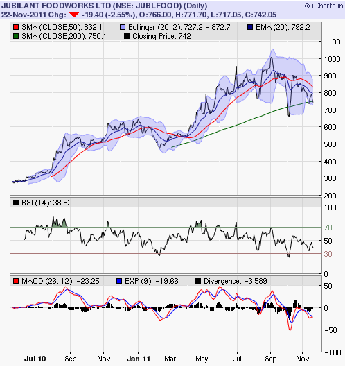
Here’s the battle at the 200DMA line that is going on at the Jubillant Foodworks counter. Ever since I wrote about this stock on the pizza vs. Italy post, I have been looking at it keenly.

Let’s see what happens.

The Great Depression vs. The Great Recession

For most of the day today, I have been reading a bit about the Great Depression (GD) of the Thirties and Forties in the US. It is natural to compare the events and situation of today to those times and  hope that the lessons from the GD can be applied in today’s situation as well. If the GD tableau is to really serve as a money management lesson then it is very important to establish the fact that the two scenarios were actually quite similar.

That is where the fun begins. Many eminent people (Incl Ben Bernanke) have maintained that the current situation (i.e. the Great Recession) is not the same, nor similar to the GD of earlier times. It is stated that during the 12 years of the GD, the unemplyment rate went upto 25%, a third of the US banks went bust, the US GDP fell by a third and the US stock market  fell by 90%. Nothing like that is happening today, so what we are experiencing today is just a recession. It may be a great one, but it is not a depression. Well, what if the unemployment figures of the GD were inflated and the emplyment statistics of today are being supressed for some reason? The reason why so many banks did not fail during this time is because the government (actually, all over the world) stepped in and bailed them out. The book I am reading says, “between 1923 and 1929 banks across the country failed at an astonishing rate of two a day, but the rising prosperity masked those failures”. Which means the banking norms then were not as mature as they are today. So, here’s a question: in today’s age, aren’t events at Lehman, Bear Stearns, Citi, JPMorgan, AIG, BofA, Freddie Mac, Fannie Mae etc equivalent of those banks failing then. Comparing on numbers isn’t correct since consolidation in the banking industry hadn’t happened during those times. Click here for a very lucid article of the comparision between the RD and the GD.

The GD was truly a scary time. People living today (esp outside of the US) would find it difficult to comprehend or associate such times with the US. Of course, financial hardships caused by famine, war, natural disasters is common is many parts of the world (incl. India) but to think that the people who lived in the engine room of the world’s economy had to stand in “bread lines” to get food is both surprising and revealing at the same time. Well, the bread lines formed because there was little or no social security net in the US during that time. If the GD would have never happened and therefore if social security would have never come about, wouldn’t the GR of today become similar to the GD of those times?  Here is an extract from the book I am reading which in turn is an extract of an anonymous letter which a 12 year Chicago boy had written to the “Mr. and Mrs. Roosevelt in Washington D.C.”

I’m a boy of 12 years. I want to tell you about my family. My father hasn’t worked for 5 months. He went plenty times to relief, he filled out application. They won’t give us anything. I don’t know why. Please you do something. We haven’t paid 4 months rent. Everyday the landlord rings the doorbell, we don’t open the door for him. We are afraid that we will be put out, been put out before, and don’t want to happen again. We haven’t paid the gas bill, and the electric bill, haven’t paid grocery bill for 3 months. My father he staying home. All the time he’s crying because he can’t find work. I told him why are you crying daddy, and daddy said why shouldn’t I cry when there is nothing in the house. I feel sorry for him…Please answer right away because we need it or we will starve. Thank you. God bless you.

I am pretty certain that there are 12 year old boys in the US, who would not be so misplaced in today’s times as to not write similar letters. Ultimately, it is best for plebians like us to assume that financial “experts” are often wrong and that astrology and economics don’t mix. Earlier, they’d say India has de-coupled from the world! After that, the grey cells started debating nuances on whether the current “slowdown” is a recession or not. However all are now of one voice when they say that A) India is as coupled to the world economy as copper is to iron in a bimetallic strip and B) we are indeed in a recession. Is the realisation that we are in a depression around the corner as well? If that happens then you may as well desert equity as an asset class to base your future planning on…

The Italian Job

There should be a rule against letting such colourfully inspirational leaders as Berlusconi from stepping down. The people behind this should be shot. Now that Italy’s given the boot to Berlusconi, reading news from that not-so-well-heeled country will not be the same as before. 😦 One fondly remembers the time when Berlo had poured scorn on Finnish food saying that he had had to “endure” it adding that there was absolutely no comparision between ham from Parma and smoked reindeer venison. The issue was regarding Italy’s bid to be chosen as a home base for the European Food Authority (which in turn would have meant a lot of benefit to the local Italian food processing industry). This was in 2005. The last, somewhat consolatory laugh probably belonged to the Finns when Kotipizza Oyj, the largest pizza restaurant chain in the Nordic world, won the America’s Plate International Pizza Contest  (in 2008) over their invention which was very aptly called “Pizza Berlusconi”. It has smoked reindeer in it.

While I am not so much of a gastronome to sample smoked reindeer pizzas, I held Silvio in high esteem for the wise lessons on investing that he once dispensed at the NYSE:

Italy is now a great country to invest in…a reason to invest in Italy is that we have beautiful secretaries…superb girls. 

 Now, I am not sure if the chartists and technical gurus out there, who spend all their time reading between the (trend)lines have ever thought of mapping and charting hemlines. But Berlo obvisouly had spent a good deal of time on that subject and he let the world of high finance know. While he may not have intended it thus, this sermon might have proven to be very profitable indeed for an international investor with A) a very sharp memory; B) a natural ability to make logical connections and C) a Berlo like keen eye for beauty! Berlo’s view of short hems in Italian offices was to really serve as a trading signal to go “short” on Italy itself! I am sure many people made money shorting Italian bonds, stuffing profits in Italian bags and being long Italian credit protection. Also while Finland got their psychological payback via the Pizza Berlusconi, that episode also throws up an investing lesson. Being long on pizzas is not the same as being long on Italy itself.

Towards that end, I came up with this chart which can be a good contender for one of the most profitable set-ups in recent times. Go LONG PIZZA + SHORT ITALY. Using metaphors, this could mean shorting the MSCI iShares Italy Index fund and going long on Jubilant Foodworks (the makers and sellers of Dominos Pizza in India). I have no idea how pizza foodchains are doing in other countries but Jubilant has been rocking. Though their dough is acting tough these days, what with the share price perilously close to the 200 SMA mark and questions being raised on the company’s ability to maintain its sales growth trajectory going forward. Whatever happens to the share going forward, its performance in recent times has been awesome.

 Hungry Kya?

The 200 DMA Pivot

During a bull market, breaks below the 200-DMA tend to represent good buying opportunities. During a bear market, breaks above the 200-DMA tend to represent good selling opportunities. The challenge, of course, is to be able to weigh all the evidence and arrive at a high-confidence conclusion as to whether the previous major trend is still in force because every break of the 200-DMA will be a false signal…until the last one.

Market makers track the percentage of stocks above/below their respective 200DMA. If this number is greater than 85% or 90% then many traders look for a reversal in the market. On the other side, when this indicator plunges below 20%, people hope for an upswing. Ergo, most traders may end up avoiding stocks that are trading below their 200DMA. Whether the line is the cause of trend reversal or not is not my point – i haven’t read enough to make that point. All I am saying is that if enough people behave in step, it can cause a stampede. Who cares who cast the first stone in the pond and caused the ripple? As long as enough subsequent ripples/waves follow that first in synchronous phases, you can have the makings of a great wave. Then there is the “golden cross” which is the point at which the 50DMA and the 200DMA cross each other. A close (and sustenance) of the 50DMA above the 200DMA is supposed to indicate the commencement of a bull journey (and vice-versa). When used in conjunction with the 50DMA, the 200DMA line provides some trending views: if a stock that has price trading above its 50DMA and if the 50DMA is above its 200DMA then the stock movement is bullish and the trend should continue. A natural logical extension of the above rule is to consider the 200DMA as support and resistance levels. This is what appears to be the case with the NIFTY currently. Will the 5400 level get taken out? If the index closes and stays conclusively above 5400 then maybe this will become the new support line. The index could hover around that level, being range-bound and wait for the 50DMA to catch up and cross-over the 200DMA giving a clear signal of an intermediate up-move. Alternatively, with Trichet (President, European Central Bank) warning all that the Europe’s sovereign debt woes are far from over, it could well be possible that the 200DMA level does not get breached by the NIFTY and the index falls down. I have no hunch and in moments of apparent inflection points such as what i am thinking next week to be, it’s best for retail rats like us to sit the action out and see what happens.

Here’s a trading strategy:

Monitor your portfolio. On stocks that you pick (whatever be the method), get out of them if their price falls below their respective 200DMAs. Stay in cash and re-enter when the price goes above the 200DMA.

I have a feeling that, if this tactic be consistently applied over a long time period, it would yield superior returns to a “random walk” style of investing even after taking transaction costs and taxes into account. This scheme may not work in markets like Europe, US or Japan, but this would be very applicable to economies that are in the middle of their S-curve of economic growth (China, Thailand, India…)

Deepak Shenoy has given some direction here on how to live under the 200DMA line.

And finally, a very important trading lesson picked up from State of the Market:

One should never buy stocks on HOPE when they trade below 200 dma and one should never sell stock on fear when they trade above 200 dma because no HIGH is too High and no Low is too Low.

ITC’s Run: Fork in the Road?

There is always a bull market somewhere. Take a look at how ITC has behaved over the past 18 months (charts via icharts.in). It seems it will take more than a few ‘puffs’ to get it past the 210 line. So may not be the local nadir. But when one looks at the past 10 years chart, this looks a good time indeed. Whats the point in timing over such fantastically run companies anyways!

Design a site like this with WordPress.com
Get started