Value Investing
21-Oct-15 Leave a comment

18-Oct-15 Leave a comment
 The addition of the third dimension to the charts that most people make is something that has always puzzled me. It seems as if restating an essentially flat planar picture by including an added dimension adds more ‘depth’ to the message. I guess folks with a predilection to 3D think that they are adding more weight to their chart (and therefore their argument) by doing this. And also some ‘enhanced’ aesthetics.
That gets me to my main point. This is so so wrong. It is not about the chart at all. The excessive use of 3D talks a lot about the person who prepares this chart. Yes, a lot of criticism has been leveled at Microsoft Excel for continuing to offer super un-intuitive and irrelevant chart options and presets in its charting menus. Ribbons have come and gone but MS Excel continues to offer murderous weapons of data visualization. Now, if a murder is committed and a data story is brutally butchered, the culprit is not the agency that manufactured the weapon but the hands and brain that performed the mutilation.
So why do people do it? I have the following hunches:
My suggestion: avoid 3D unless showing spatial engineering, scientific or mathematical data. I don’t think too many readers of my website are engaged in visualization of engineering data like the locus of an electron in a cyclotron, or the spatial plot of isomorphic mathematical figures ….
MS Excel is vilified, but it is just a tool and quite powerful at that if one handles it with patience and precision. Maybe passion as well. I have pinned below some of my favourite visualizations that I have posted on this website earlier. Each of them have been prepared by me using standard features of MS Excel and the image editing functions of MS PowerPoint. 🙂


28-Sep-15 Leave a comment
 India and US trends in acreage per farm plot are opposite. Farms in the US are getting larger while those in India are shrinking. Consolidation lends to economies of scale, higher mechanization rates and therefore greater productivity and profits per acre. Farmers in the US are experimenting with big data, information analytics with farmers showing as much interest in selling the data from their farms as much as their crops. Farmers in India, on the other hand, are contemplating ending their lives adding to the
 big bigger data points on farmer suicide statistics – at least some of them kill themselves each year. The rate however is not as alarming as it is made out to be. More people die of suicides outside of the farms. I am sure depression kills more in our cities but farmers attract attention.
 The chart above shows the general shrinkage of farm sizes across the India. The average size of farmland in India has fallen from 2.28 hectares in 1970-’71 to 1.16 hectares in 2010-’11. Punjab is an exception. If you want to sell tractors and motor pumps and pvc pipes, this is the place to hang your shingle. Increased mechanization and dwindling farm incomes forced many small farmers to quit farming, migrate to Kanaada leading to a consolidation of farmlands. In almost every other state, there is a shrinkage. It is no doubt a consequence of
increasing pressure on the land due to an ever expanding population. With lower farm plots (i.e. capital) and the low productivity rates, it is impossible for the farm incomes (return on capital) to be enough to feed the stomachs aspirations of all the strapping young village gabrus hanging around in the hinterland. Kerala and Bihar are the two states with the lowest average acreage per ![chhath_train_71113 [httppost.jagran.com]](https://kaushalmahajan.com/wp-content/uploads/2015/09/chhath_train_71113-httppost-jagran-com.jpg) farm plot. It is not surprising that the villagers from these states are most likely to be found migrating to other parts of the country in search of work. Trains are best avoided during annual jaunts like the Chhath Puja when all the itinerant workers head back to their native places to take the traditional early morning dip in obeisance to the sun who no longer shines on their farms as it once used to.
farm plot. It is not surprising that the villagers from these states are most likely to be found migrating to other parts of the country in search of work. Trains are best avoided during annual jaunts like the Chhath Puja when all the itinerant workers head back to their native places to take the traditional early morning dip in obeisance to the sun who no longer shines on their farms as it once used to.
08-Sep-15 Leave a comment
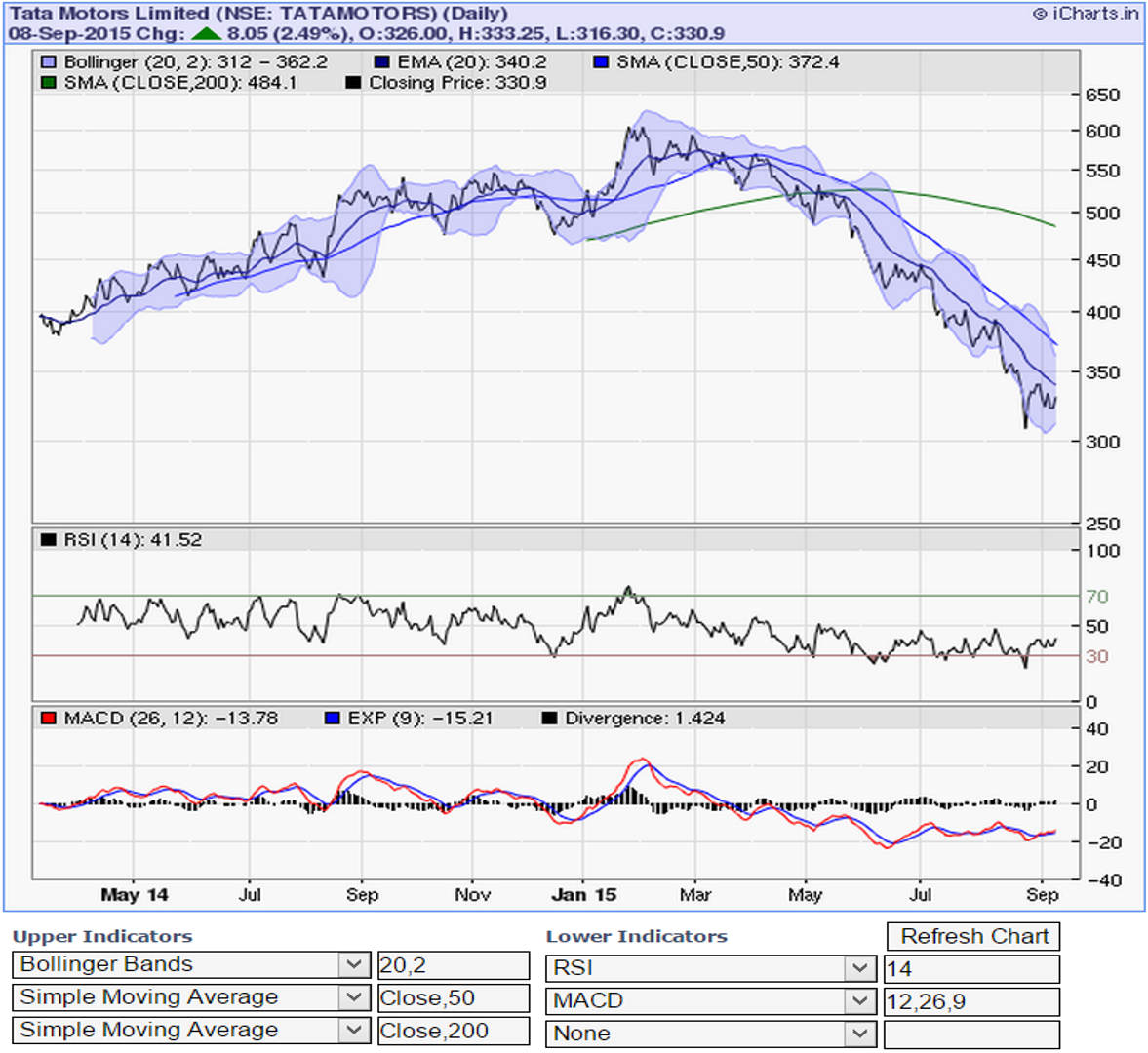 The stock of Tata Motors has fallen ~45% in the last 7 months! That’s a big drop for a big company. The stock’s around 10 times it’s trailing 12 months’ earnings. Upstarts like Flipkart are getting valued more than Tata Motors. That’s surprising. Is it about the unattractiveness of the business of making cars or is it a case of over-valuation of ecommerce businesses or is it both? Tata cars are everywhere, including China. It’s quite a venerable brand not to have a Peter Lynchian roadhead moment on:
I am a hard working taxi driver and I have seen my share of cabs and cars (mostly cars that looked like cars) and have even heard of some feline roadhogs (read Jaguars) and then my last passenger told me about this massive 45% drop in the share price of the company that makes these things. I have this Peter Lynch moment and I want to buy this stock.
It’s the crumbling of the Chinese walls that is a part of the reason why the stock’s down. Cool Chinese have been doing uncool things like not buying Jaguars as much as they used to earlier. Things have been very bad for the company during the last couple of quarters. So bad that they chose to raise capital via a rights issue. That’s a sure shot sign of severe financial stress. Worse, the stock price kept of falling leaving the rights price level far behind. And then the unkindest cut was the skipping of dividend by the folks that run this rather complex business.
But then I am a surfer. An opportunist and a speculator. I am rooting for a 35% return on this idea.
Here’s some pointers to mull over:
05-Sep-15 Leave a comment
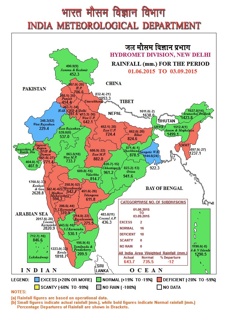 Yesterday was unusually different. We have all lived through hotter days but the combination of dryness, heat and disappointment was unique given it is just the start of September. The weathermen and all related folks consider the rainfall received in the four month period from June to September as representing the rainfall for a particular year’s S.W. Monsoon quota. Using data from the
India Meteorological Department (IMD) website, here is the story in pictures.
2015 monsoon till date has been grossly insufficient and with just Sep 2015’s data to be made available, things don’t seem to be looking too bright. With days like yesterday, I am not sure if the rest of the days left in this month will make good the gap. So, in addition to the external stories weighing down on the stock market, this internal will, no doubt, add impetus to the decline. Maybe the efficient markets have factored this in, maybe not. The Indian economy may be resilient to droughts but it is certainly not drought proof.
If you look at the charts below, the heavens have not been too kind over the last 15 years. Looks quite similar to the decade at the start of the 20th century.

I think we will end the 2015 Monsoon season at the 750 – 775 mm of rainfall band.
30-Aug-15 Leave a comment
The Food Safety and Standards Authority of India (FSSAI) seems to be extremely busy and for good reason, I guess, considering that we have a billion bellies to fill. There is literally a bull run going on when one looks at the noodles of media mentions that this august institution has been garnering ever since it came into existence in 2006. The first chart below shows this uptick in popularity. If you are a technical chartist, I am sure you will see some pennant patterns getting formed. Pennants of waving authority in the name of food safety. Authority indeed!  The “Authority” has quite authoritatively stamped its seal of disapproval on more than 400 food products between Aug’12 to Apr’15 (see chart on the right, below). This is based on the list of product applications that were rejected by the FSSAI. This list is available on FSSAI’s website.
When I look at the list of the food items banned by the FSSAI, I realize that I have consumed around 20 of them myself. Is that why I am suddenly feeling queasy? I miss my “meri blog post karne wali Maggi“?
I obviously do not understand anything about food safety and regulations apart from the fact that food items, while being agents of nourishment are also implements of commerce, livelihood and international relations. In that context, and bereft of any finer nuances of information, some of the actions of the FSSAI seem to be out of balance. And it personally hurts as well – especially if they work again to keep my beloved Glenfiddich, Glenmorangie, Aberlour [oh, yes!] et al out of India. 😦 The FSSAI’s apparent objection to the import of the bottles of these ambrosia is that their manufacturers have/had not mentioned “water” as an ingredient in the product labels. Lindt, makers of chocolate since 1845, have/had reportedly dropped their business plans in India since they could not explain some finer
points of “composite chocolates” to the Authority. FSSAI was also reportedly ‘cheesed off’ at the  importers of Parmegiano Reggiano because it is made of milk that is not pasteurized. Huh! I consume P. Reggiano regularly and I don’t care whether it made of pasteurized milk or not considering that this King of Cheeses is a Protected Designation of Origin (PDO) food and has always been made this way since the Middle Ages. There are accounts of green olives being allowed into India but black olives being ‘black’ listed since it may have been surmised that black olives are green ones gone bad! At least that’s the story being trolled around in the Internet. The picture on the right is my attempt at creating a food basket of some of the foodstuffs which have earned the attention of the FSSAI over the years.
It’s imperative to “build a healthy India with safe food”, but not at the cost of logic and good business order. Outliers do tend to get noticed, reported and talked about. The 2013-14 annual report of the FSSAI does show that the organization cleared 99.79% of shipments for import  clearance, but I guess parties connected to the balance 21 basis points make a lot of noise and complain. So I think there is some PR work that needs to be done by the FSSAI to maintain and improve its image amongst the intelligentsia. There is indeed a Facebook page, which has some really useful food safety information amid all the clutter of the automated feeds of their periodic notifications and circulars. Their isn’t much traffic on their Facebook page though – they need to solve for that. There is also the question of whether the organization is staffed adequately (both in terms of the number and quality of employees) and if it has adequate testing and admin facilities. If one goes by the steady stream of adverts for open jobs put up on its website, it does appear that the organization is looking to hire aggressively. The mandate of FSSAI is extremely large and my hunch is that the proficiency and sufficiency of the testing labs will lag for a very long time. According to the BCG [link], India’s food market is a staggering 23 lakh crore in 2014 and is expected to grow to 42 lakh crore by 2020 (13% CAGR). To monitor a 2,300,000 crore industry, the FSSAI spent 42 crores during 2013-14 doing stuff. Thoroughly inadequate. The white dot in the picture on the right is the FSSAI – sitting as it is in the center of an industry which is approximately 55 thousand times its annual spend. The picture is scaled down to 20% – at it’s full size the black circle would not fit your computer screen.
20-Aug-15 Leave a comment
Back after a gap of more than a year. A lot happened in the interim. Completed my 40th turn around the sun, have been reading a lot (all non-fiction) and struggling to overcome my writer’s block. I guess a few of you literally kicked me out of my slumber to start writing again. Another motivator to post is what I have been reading lately:
That the markets may be getting ready to fall big this fall. All over the world stock markets are crashing. Even The Telegraph has started talking about doomsday and other apocalyptic messages. Do read the link if possible – has a lot of charts and explanations in a (hopefully) simple to understand manner. The Chinese devaluation of their currency was a shocker (in more ways than one). Not that I was long on the Remnimbi Yuan but some things happened. I had to down myself a couple of pegs even as our neighbours downed their currency a peg or two down. So I looked up the performance of some world equity indices and their corresponding currencies during the trailing twelve months to develop a personal view on what’s happening.
The chart below shows a scatter of the % change of a country’s representative stock index plotted against the corresponding % change in its national currency vs. the USD. A few outliers like Venezuela (stock market up 500%?) and Ukraine (equity down 27% and currency down 60%) were left out to bring the other data points into comparative focus. The worrisome point is that while we may not think much about a Ukraine being an outlier (due to relatively lower market cap) but then what would you say to a Russia with a currency devaluation of 77%? The other thing of note in the chart below is the bunching up of the green dots. They represent the various Eurozone countries, most of them falling in a common “y-band” due to the pegs that they have on the Euro. The question of entropy and equilibrium that I am asking is: How can a -40% to +40% range in equity returns sustain itself on a foundation of such a narrow difference between the movements of their respective national currencies. Doesn’t this portend to the Euro equilibrium going out of balance?

While the above chart has data corresponding to 85 countries, the chart below shows the top 20 countries. Look at the golden quadrilateral formed by the points represented by the BRICS. Clearly each of the BRICs have followed unique paths to get where they are on this chart. Already fewer than 20% of Emerging Markets are trading above their 200 DMA levels (link, link). My hunch is that China will quickly begin moving towards the left on this chart. Smart Chinese money has already moved out of equity (link). My hunch is that China and Russia will move left the most. India will certainly move left but perhaps not to the extent that China will fall. That’s my hunch. I may be wrong, but I think soon enough a time will come when it will pay to be ready with your shopping bag. Hopefully the stock market will go ON SALE!!!

12-Jun-14 3 Comments
 Brazil 2014 is finally here – after a 4 year long wait. Interestingly, almost all the predictions out there seem to be pointing towards a Brazil victory. Here are some of the predictions I have come across on the internet:
Why watch then? 🙂
11-Mar-14 Leave a comment
Are accuracy and precision the same thing? They are certainly used interchangeably. Accuracy is telling the truth while precision is telling the same thing again and again.
Here’s something I created based on what I have been reading lately. If you are in the bottom left quadrant, you are inaccurate and imprecise in your work, your investments or in your life, you are basically wasting your time and resources. If you focus on one area or strength or specialization and shut everything else, you may move along arrow #1. This is a path of standardization of processes, doing one thing and doing it repeatedly. You’ll be quite predictable but if your area of specialization is not well chosen, you’ll be far away from winning big. Then a focus on the problem statements you’re trying to solve or the way you spend your time may lead you on path #3 and take you extremely close to the truth and quite predictably too. You get into the habit of winning and you win repeatedly.
On the other hand, if you want to escape wasteland by taking path #2, you would essentially continue to multitask and continue to be curious and exploring but with better tools, techniques and processes. Paths #2 and #3 are the avenues for invention and process improvements, of changing the game. paths #1 and #4 are about repeatability and efficiency.
If this is worth your time, do examine a topical issue that you may be mulling over using this lens – maybe it will be worth your time after all!


Recent Reactions